Introduction
In tennis, factors that influence the game are not only the surface. It is much more like the aesthetic appeal but also the playability ability there are colors and patterns on a tennis court. Switching up to appropriate colours for your tennis arena turns it around by creating an exciting environment where those participating feel involved because they can see things better, reducing reflections, and making playing more fun. Presented is a comprehensive article on transforming your tennis court shades with various colours, the advantages of contemporary colours, and practical suggestions for choosing the best court colours.
Importance of Tennis Court Colors
Enhancing Visibility
Colours are very crucial for tennis court flooring since they can improve players’ visibility and the visibility of the ball that falls outside of the court as well. The point is that most people like traditional green and red courts due to their classic view as long as tennis balls do not need any painting; however, tennis court shades change with each generation as more colours (like blue or purple) become popular among certain groups while other players opt for them depending on their mood or feelings at the time of choosing a particular shade. Nonetheless, some new shades are just too good at making the ball look like stars even in dim light.
Reducing Glare
Some colours are better at reducing sunlight or bulb brightness to help athletes concentrate on the game, therefore. Consequently, for example, deeper blue or green hues absorb more light thus avoiding mirror-like glares that are likely to interfere while playing.
Boosting Aesthetic Appeal
A good-looking court designed with current colours will significantly improve the attractiveness of a building. Regardless of whether it is a standalone court or one within a sports facility, a bright and well-kept compound will increase the number of gamers and occasions held hence making the site more beneficial.
Improving Player Experience
Different shades can impact how we feel and behave. For example, more active and alert gamers will created by bright friendly colors; also it has a positive impact by helping them relax and refresh tired minds. Through colour schemes, today’s look can be friendlier and encourage all gamers equally.
Popular Modern Shades for Tennis Courts
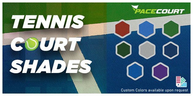
Cool Blues
For tennis courts, blue is very trendy now. The different shades of blue – from the light sky to deep navy – are popular for their good contrast with yellow balls that make them easier to see by both players and fans. There is also something soothing about playing on something cool-coloured like blue; it helps when things get tough in tournaments that require intense concentration.
Vibrant Greens
Green is a conventional colour many people associate with tennis courts, but new shades like teal and lime green have come on stage which give it a not so ‘usual’ appearance. Such colours are good for vision, blend naturally with other settings and as such will be perfect for courts within parks or any residential estate that is meant to be outside.
Dynamic Reds
A warm, energetic feel is offered by red courts such as terracotta or burgundy. These colours, which are usually meant for clay courts can as well work on hard ones too to make them unique and filled with life in them. They give very good visibility against that ball and hence become too eye-catching, especially at edges that complement them.
Bold Purples
Purple courts can give a facility a high-end, contemporary feel. Shades such as lavender and deep purple are becoming more popular because of their striking appearance and superior contrast with the tennis ball. Purple is a bold, modern choice that stands out and creates a unique playing environment.
Custom Color Schemes
Custom colour palettes provide individualistic designs reflecting an institution’s characteristics, such as a school, a group of people, etc. Adjustments like adding logos, and mascots — colours draw certain associations with the team’s name or its peculiarities—may also included in it. In this amount courts beginning from ground level will always remain alone precisely because such changes would be unforgettable.
Benefits of Modern Tennis Court Colors
Enhanced Playability
Modern styles allow for improved playability concerning a clear view of the tennis ball against the tennis court surface. Both the players and those who come to watch the match consider it very important. It is much simpler to follow the game if you compare it with blue or purple lenses that provide high contrast against yellow tennis balls for instance.
Increased Player Comfort
Players can be made to feel more comfortable and focused by colours. They have a calming effect, making it possible for participants to remain cool-headed throughout the game. This could be a real game-changer in competitions.
Environmental Integration
Modern colours enable your court to mix harmoniously with the surroundings. Green shades can used to accommodate the park or any other outdoor location thereby making the court look attractive. On the other hand, bright colours would make a statement thus being outstanding in a town.
Customization and Branding
Modern colours provide chances for customization and branding. Clubs, schools as well as sports complexes may utilize their colours to create an identity that is not similar to any other. Logoized or with mascots it is possible for courts to reflect the organization’s spirit.
Durability and Maintenance
The latest tennis court surfacing have developed to last long and stay attractive when fitted with high-quality coloured coating. The choice of colours is not only aimed at making them look nice but also at enabling them to resist rainy weather, and ultraviolet rays as well as being used regularly which tires them so quickly and helps keep the playing areas more lively as well as much operational time.

Practical Tips for Choosing Tennis Court Shades
Consider Your Environment
Pick colours that enhance and do not contradict what is around. If one is in the open outdoors, soft-tone colours like green and blue are best. In places where there are many people, one can consider aggressive colours like red and purple.
Think About Visibility
Make sure that the picked tones should present a good difference from the tennis ball. For instance, blue and green colours can seen well but the shade must tested under various lighting for best results.
Reflect Your Brand or Identity
If the court is stationed at a club, school, or community facility, incorporate colours that resonate with the institution’s colours. These custom colours are important as they help support brand identity by creating something unique and differentiable to the audiences.
Evaluate Maintenance Needs
Collaborate with experienced court contractors and colour consultants to choose the best colours for your project. Firms can share the latest developments in colour placement, as well as offer suggestions on how to enhance the durability of some chosen colours.
Consult with Experts
Partnering with our experienced tennis court constructors and colour experts when choosing the most suitable shades for your requirements is the best thing to do because they have information on current trends, performance things that need consideration, and what needs to be done to ensure you maintain your chosen colours.
Personalize Your Tennis Court with Custom Colors
Elevate your tennis court with a unique, personalized touch. Choose from a wide range of custom colour shades that reflect your style or brand identity. Contact us today to explore our customization options

CASE STUDIES
Case Study 1: Upgrading a School Tennis Court
Location: Chennai, India
Project: Modernizing an outdoor tennis court at a private school
Challenge: The tennis court of the school was traditionally green and worn out, which made it visibility and aesthetic lack. The creation of enhancing the performance of a player in school spirit demanding modern court that is pleasant to eyes went forward.
Solution: The tennis court of the school was traditionally green and worn out, which made it visibility and aesthetic lack. The creation of enhancing the performance of a player in school spirit demanding modern court that is pleasant to eyes went forward.
Outcome: The fresh court has been well-received by students and coaches with its improved visibility and good looks. The bright colors also improved school spirit, and so this court has been used for a lot of school tennis events such as hosting inter-school matches.
Case Study 2: Community Park Tennis Court Renovation
Location: Pune, India
Project: Renovating an outdoor tennis court in a community park
Challenge: The park’s lush green surroundings were poorly blended with dusty hailed red which made the park look bad. This was the reason why we wanted a modern colour on that tarmac to match the environment and attract more visitors to the park.
Solution: The court’s colour scheme was teal and lime green, chosen by the project team. Its colors were fresh, contemporary, and well blended with the park’s environment letting anyone who played there see the ball well because there was no sun reflection.
Outcome: The renovated court was interesting to the local tennis enthusiasts and families. Bright, nature-like colours enhanced the park’s overall aesthetic, encouraging residents to do outdoor activities more often. As a result, the court’s appearance and functionality improved, leading to more use for tournaments and local events.
Case Study 3: Corporate Sports Complex Enhancement
Location: Bengaluru, India
Project: Enhancing the tennis courts at a corporate sports complex
Challenge: The intent was to make an updated, branded appearance mirroring the dynamic and innovative culture of the company. The corporate sports complex was interested in upgrading its amenities so that it could offer its staff high-quality recreational space.
Solution: The tennis courts at the complex were made to be bold purple and white. This choice of colours was made to allow them to represent the brand of the company and catch one’s eye. The court design included custom logos and brand elements to enhance the corporate identity.
Outcome: The new courts at the sports complex quickly became a favourite hangout for numerous workers. With its bold, clearly-branded design, it represented a perfect match to the company’s brand image, hence fostering pride and cohesion among workers. These courts held corporate tournaments and events that served to enhance team spirit and promote staff participation.
Conclusion
Pacecourt always looking to make it easier for players to see during a match, reduce maintenance costs by ensuring that cleaning checks are done regularly, and add curb appeal – modernize your tennis court with the best paint shades. Choose colours that serve you well in all these aspects as well as others that matter most for successful facilities. To do this, think about the general atmosphere they will use; something vibrant and encouraging should played upon. The perfect colours, which represent the classic blues and greens as well as the strong reds and purples themselves can alter your arena into a contemporary, elite sports facility.
Frequently Asked Questions
Aesthetic Appeal: Attract more games and players by improving the physical attractiveness of the court through vibrant colours that are modern and attractive.
Customization: The court will be distinctive and unforgettable by using modern shades that mirror the essence of a club, school or community
To choose the best colour for your tennis court, consider the following factors:
Environment: Choose colours that match the natural environment. Outdoor courts will look more uniform when using shades like greens and blues that can blend with the surrounding settings.
Visibility: Check if your eyes like the colour of the ball it is hitting. Spray with any bright colour you find and try it out under different types of light.
Brand Identity: We need to think about using colour according to the identity of our organization for example if the court is located within a club, school, public, or any other building.
Maintenance Needs: While some shades are more prone to dirt and wear than others, certain colours might display stains, wear and tear more easily. On the flip side, darker shades could help cover stains and tears better than their lighter counterparts; thereby, they could require lesser maintenance.

